5 Typeface Faux Pas
6 years ago • Design Tips • 1min read
When creating a presentation for a church, working on your newsletter, or typing a letter to a pastor, it’s probably your habit to use some of the all-familiar, pre-installed fonts on your computer. Typefaces such as Arial, Times Roman, and even Comic Sans are overused and saturate many of the digital and print pieces people have seen for the last 30 years. However, there’s a really simple solution to making your materials look more refined, and stand out against the backdrop of so many pieces using the same fonts.
Next time you find yourself utilizing one of those typefaces, choose an alternative and bring your materials up a notch. It may take a couple of extra minutes to install a few new fonts that pair well together, but your supporters will thank you (even if only subconsciously).
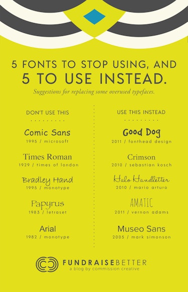
To get you started, here are some suggestions for alternate fonts that you can use when designing. Links to download the fonts are below the image.

- Instead of Comic Sans, try Good Dog
- Instead of Times Roman, try Crimson
- Instead of Bradley Hand, try Halo Handletter
- Instead of Papyrus, try Amatic
- Instead of Arial, try Museo Sans
One final tip when choosing and using fonts. Take time to search through font libraries like Font Squirrel, and Typekit if you have a subscription to Adobe Creative Cloud, for fonts to use in your next project. Experiment combining different typefaces, and with practice, you’ll find choosing and pairing fonts to be a more natural, and creatively rewarding part of your design process.